summary
Over the course of three months, I contributed to building a new design system for the Zizzi restaurant chain — a scalable UI framework designed to unify brand expression, improve efficiency, and give teams the tools to design and build with consistency.
The new system brought order to a fragmented ecosystem of styles and patterns, established a modern design language that reflected Zizzi’s brand warmth, and equipped designers and developers with over 100 reusable components. The result was a system that not only reduced delivery time by 30%, but also made the digital experience feel recognisably Zizzi across every touchpoint.
100+
custom components
30%
improved engagement
1.5 million
adopted subscribers
Vision
Before the design system, Zizzi’s digital products felt disjointed. Each product team had been solving UI challenges in isolation, resulting in multiple variations of buttons, inconsistent colours and misaligned typography, which colelctively made the overall brand presence lacking unification cohesion.
Our vision was to create a single source of truth for Zizzi’s digital brand. The system needed to capture the warmth and playfulness of the restaurant experience while ensuring clarity and usability across responsive web and native platforms. Ultimately, the design system would become the foundation for all future digital work, empowering teams to focus less on reinventing UI and more on solving customer problems.
ROLE & RESPONSIBILITIES
As lead Product Designer, my role was to shape the system end-to-end — from the initial audit through to adoption. This role required balancing strategic thinking (setting direction and principles) with tactical execution (building the library, testing, and documenting). My responsibilities included:
- Running a design audit of every live Zizzi product to identify inconsistencies and duplication.
- Facilitating workshops with designers, engineers, and product leads to align on principles, goals, and brand voice.
- Defining the foundational style tokens (colour, type, spacing, elevation, border radius) that would underpin all components.
- Building a responsive and evolving Figma library with components, variants, and documentation.
- Partnering closely with engineering to mirror these patterns in code and shared design tokens.

GOAL METRICS
We had a clear sense of what success looked like, but initial research conducted helped to validate and refine our approach. We defined our metrics as:
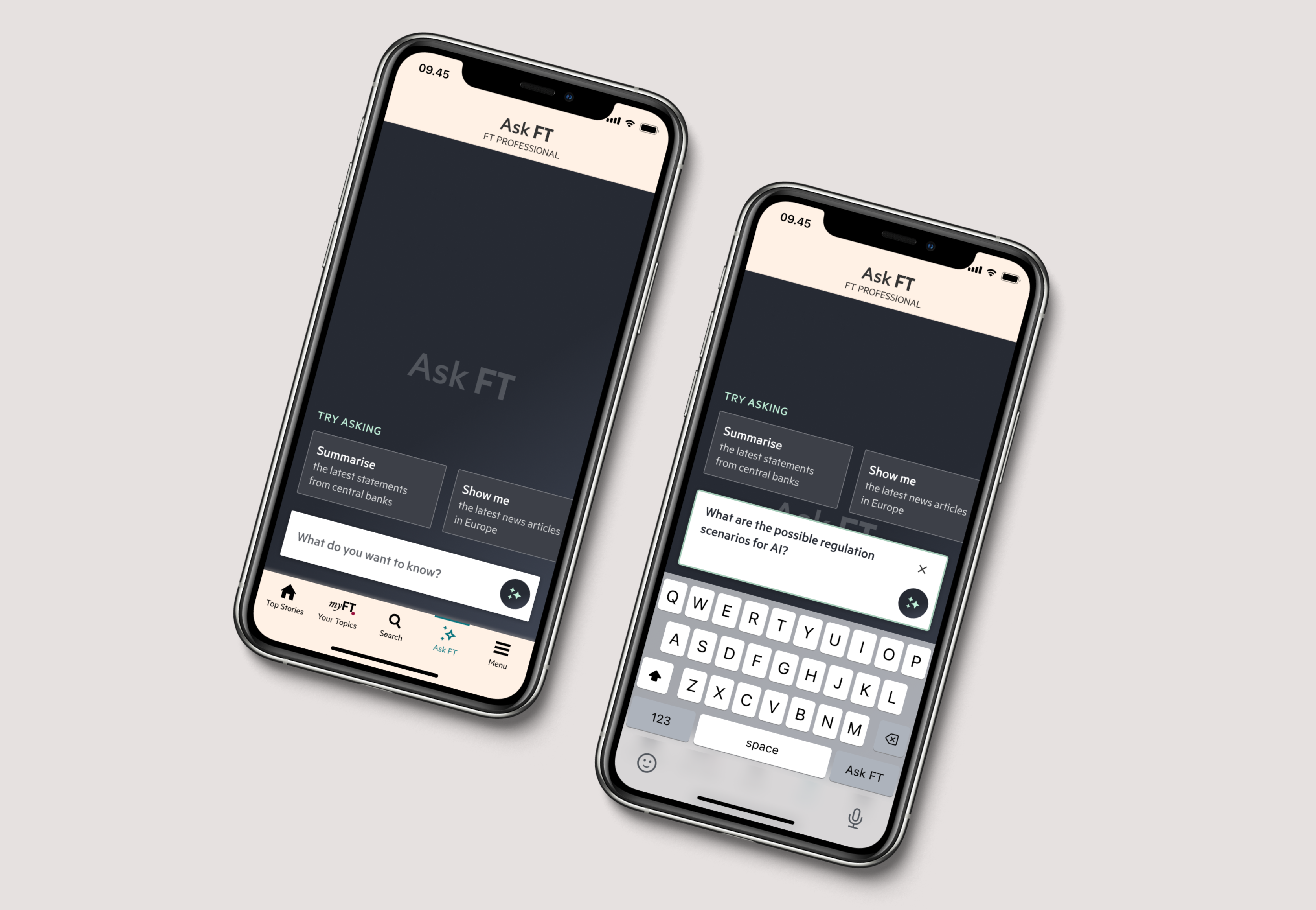
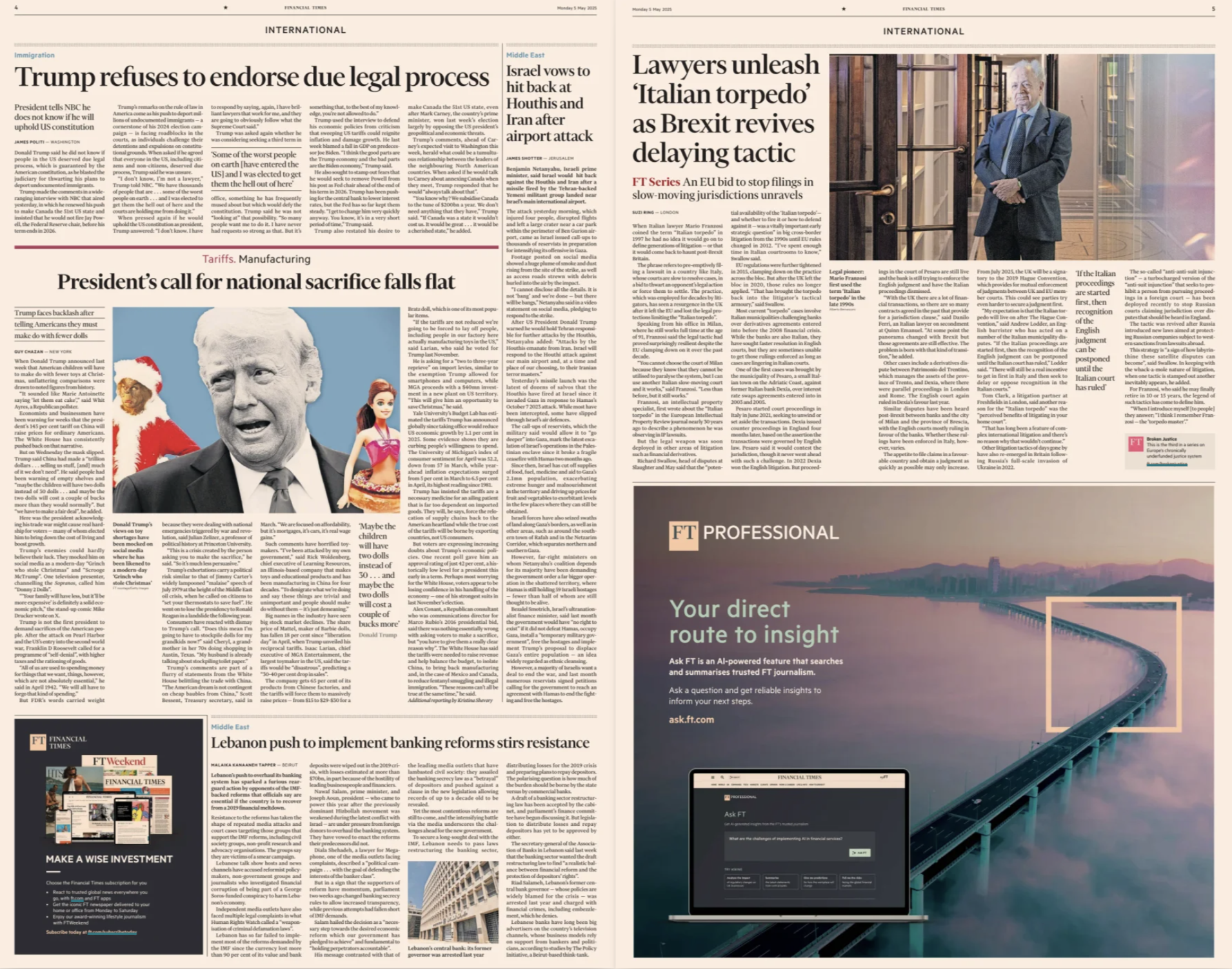
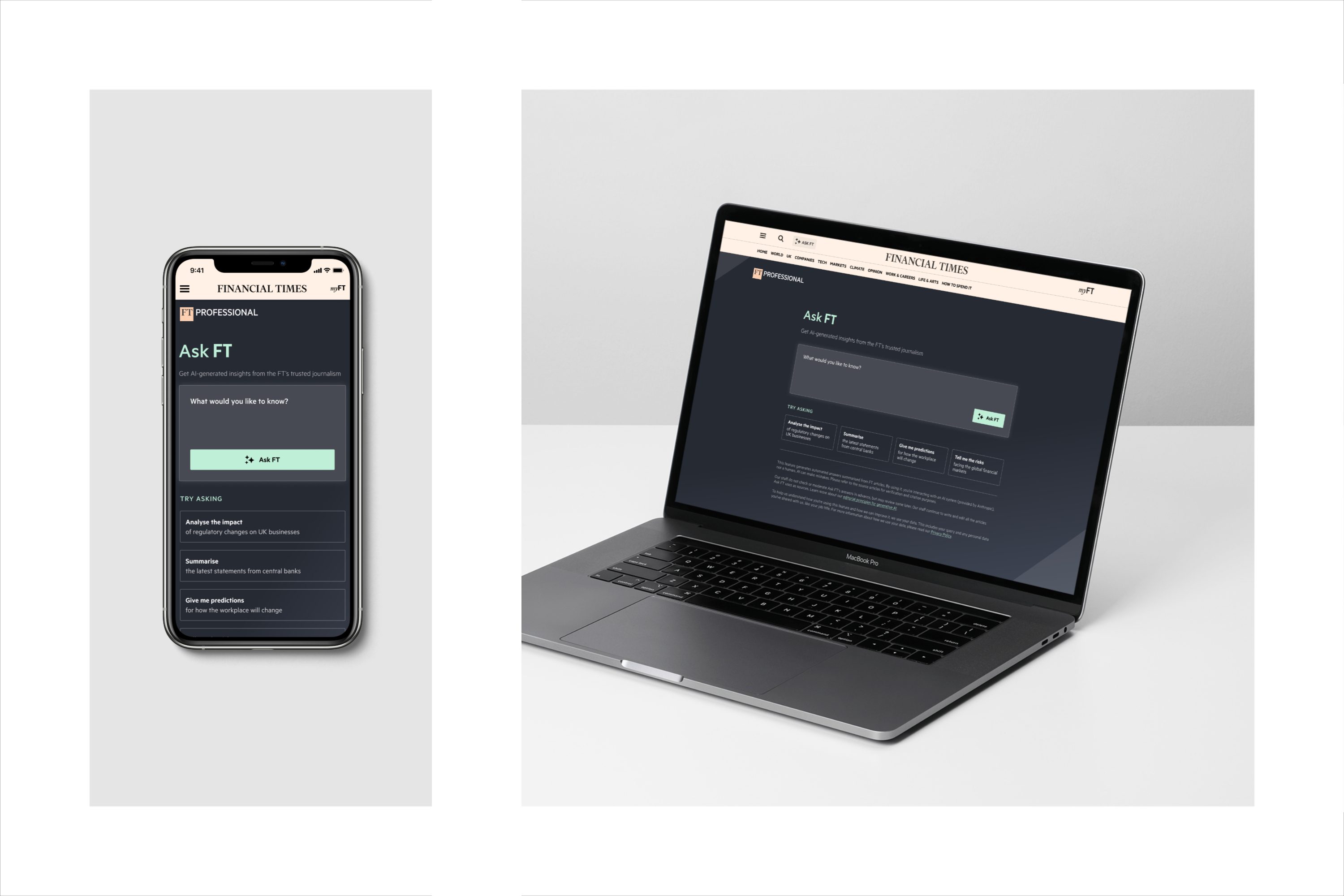
- Drive engagement with Ask FT by making it easy to find and use
- Ensure high comprehension and trust in the generated answers
- Encourage habitual, repeat usage among Professional users
- Strengthen perception of FT as an innovator in the journalism and B2B space to encourage new organisation leads, subscribers and additional seats
DISCOVERY & RESEARCH
The process began with an in-depth audit and stakeholder research. We catalogued dozens of mismatched components: six different button styles, three approaches to modals, and inconsistent use of brand colours. This fragmented ecosystem made it harder for teams to collaborate and left end-users with a confusing, inconsistent experience.
Through interviews with product managers and engineers, we learned that:
- Designers were spending too much time creating UI from scratch instead of focusing on user flows.
- Developers often built their own interpretations of components, which rarely matched design intent.
- Product leads wanted a way to quickly prototype and test ideas, but inconsistent design slowed this down.
These insights confirmed the need for a system that would simplify, standardise, and accelerate the work of every discipline.


DESIGN PROCESS
Establishing the foundations
I started by defining design tokens using the new brand style guide. The colour palette was restructured to align with brand identity — rich reds and warm accents that reflected Zizzi’s hospitality roots, paired with neutral tones for accessibility. We set a typographic scale with clear hierarchy, created a spacing system based on an 8px grid, and defined border radii and elevation levels to establish a sense of depth. These foundations acted as the building blocks for everything else.
Building components in Figma
Once the foundations were in place, we built out 100+ components in Figma — from buttons and forms to navigation, tooltips, modals, and cards. Each was designed with auto-layout, responsive behaviour, and variants (e.g. sizes, states, icons). We created usage notes directly in Figma so designers had context while they worked.
Developer integration
In parallel, we worked with engineering to ensure the Figma library was mirrored in code. We set up component equivalents and synced design tokens to maintain consistency. This ensured designers and developers were literally working from the same set of building blocks.
Piloting and iteration
We piloted the design system in the online ordering flow and marketing landing pages. These areas were chosen because they touched multiple teams and would quickly demonstrate the value of consistency. Feedback loops were tight: designers flagged flexibility issues, engineers raised technical considerations, and product managers highlighted content needs. With every iteration, the system grew stronger.
INTERNAL FEEDBACK
“We no longer waste time debating button styles — we can focus on the real user problems.”
IMPACT
The new design system immediately created measurable improvements:
- Engineers noted fewer discrepancies between design and implementation, reducing rework.
- Designers and engineers reported 30% faster delivery times thanks to reusable components and tokens.
- Interfaces across web and native now looked and felt like a unified brand, rather than disconnected products.
- Over 100+ reusable components were quickly adopted into live projects, with more added each sprint.

INTERNAL FEEDBACK
“Design and code finally feel aligned. The handovers are smoother and we’re building trust across our teams.”
KEY LEARNINGS
System scalability
Starting with foundations (tokens for colour, type, spacing) gave the system scalability from the beginning.
Early collaboration
Close designer–developer collaboration built confidence and encouraged adoption.
Established documentation
Documentation was initially too light; designers needed clearer usage examples and “when not to use” guidance.
Time
Responsive variants required more iteration than expected — balancing mobile-first needs with desktop flexibility was harder than anticipated.
Being bolder and stronger with rebranding
Being bolder with branding and using the slate and mint styles was the right decision. The directive but consistent tone of voice and messaging strongly resonated with users and enhanced product trust.
CONCLUSION
The Zizzi Design System brought structure, consistency, and speed to a fragmented digital ecosystem. It has defined how teams collaborate, reduced time-to-market, and ensured the digital experience is as warm and inviting as the restaurant brand itself.
Most importantly, it’s created a foundation for the future — a scalable system that will evolve as Zizzi’s products and customer needs grow.
NEXT PROJECT
FT Brand Refresh
“Ed has played a pivotal role in shaping our product experiences. He was able to translate complex data sets into valuable insights for users through intelligent designs”.
— Tanya Brady-Halligan, Delivery Manager, The Financial Times
