
summary
Over a 4-month period, I led a strategic initiative to redesign the FT Professional experience — a premium B2B subscription offering from the Financial Times.
The project aimed to bring clarity and cohesion, elevating value perception to subscribers of the FT Professional product suite. Collaborating closely with our FT Professional design team, a dedicated user researcher, key product stakeholders and the internal brand team, we delivered a significantly improved experience.
Post-launch metrics showed a +65% increase in brand awareness, greater subscriber confidence in their product tier, and measurable improvements in onboarding completion rates and overall engagement.
+65%
increase in awareness
4 months
of testing and refinement
4/5
subscribers saw value
Vision
FT Professional is a premium product, but the experience didn’t feel like one. Internally and externally, there was confusion about what FT Professional was, how it differed from standard FT B2C access, and what value it delivered.
The vision was to:
- Clearly differentiate FT Professional within the FT ecosystem
- Establish a premium, cohesive design language that reflected the product’s value
- Streamline onboarding to ensure new users understood what they had access to, what to do next, and how to gain value from the product quickly
The refresh was a chance to instill clarity, confidence, and consistency into every touch point of the FT Professional experience.

ROLE & RESPONSIBILITIES
I creative-led the project from start to finish. Key responsibilities included:
- Conducting a comprehensive brand audit of FT Professional’s touch points — from onboarding flows to email communications
- Collaborating with researchers to distribute brand perception surveys to internal teams and external clients
- Leading stakeholder workshops to align on brand attributes and visual direction
- Designing and iterating the onboarding experience as a mobile-first experience
- Establishing new UI foundations and guidelines for FT Professional to support future scaling

RESEARCH & INSIGHTS
We conducted both qualitative and quantitative research over the course of the project. Research participants included:
- Existing FT Professional subscribers (across industries and regions)
- Internal FT commercial and support teams
- First-time trial users of the FT Professional platform
Key insights:
- Brand perception score was critically low: only 23% of subscribers were aware they were on an FT Professional subscription
- Initial onboarding lacked clarity — users didn’t know what features were exclusive and were not aware they were joining an FT Professional experience
- Visual inconsistency and lack of brand distinction led users to assume they had standard FT access
- Internal teams were unsure how to pitch or represent FT Professional consistently
These findings guided both our strategy and our design priorities — especially the importance of a clearer entry point into the experience.
DESIGN PROCESS
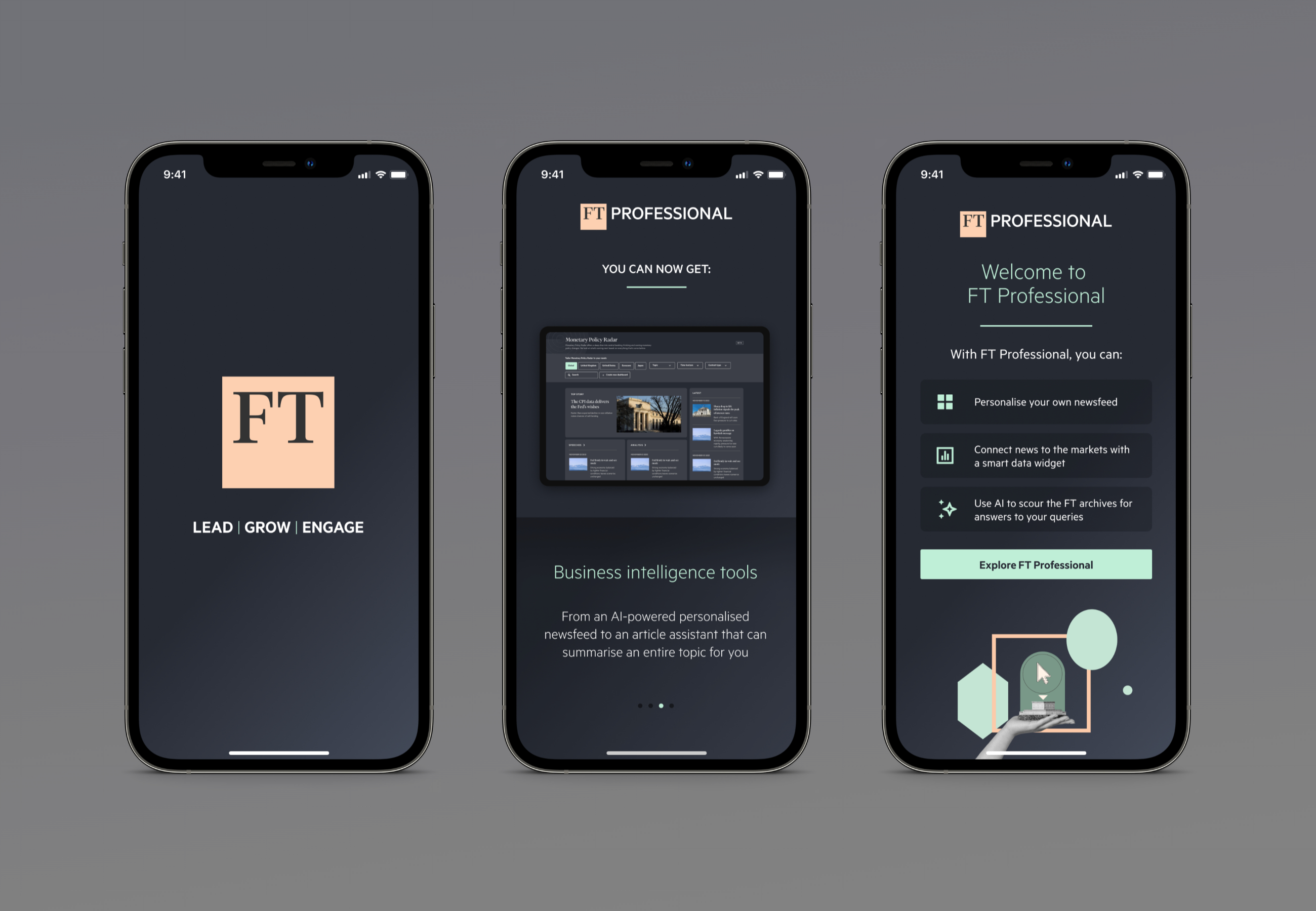
While the full experience was in scope, I prioritised redesigning the onboarding journey, based on our research findings. I partnered with engineering to ensure visual fidelity and interaction quality in implementation and mapped the user journey, identifying pain points from trial to activation.
Mobile-first experience
I designed a bespoke, mobile-first onboarding flow to empower mobile users to complete activation efficiently and seamlessly. I paid particular attention to content hierarchy and component behaviour at smaller screen sizes.
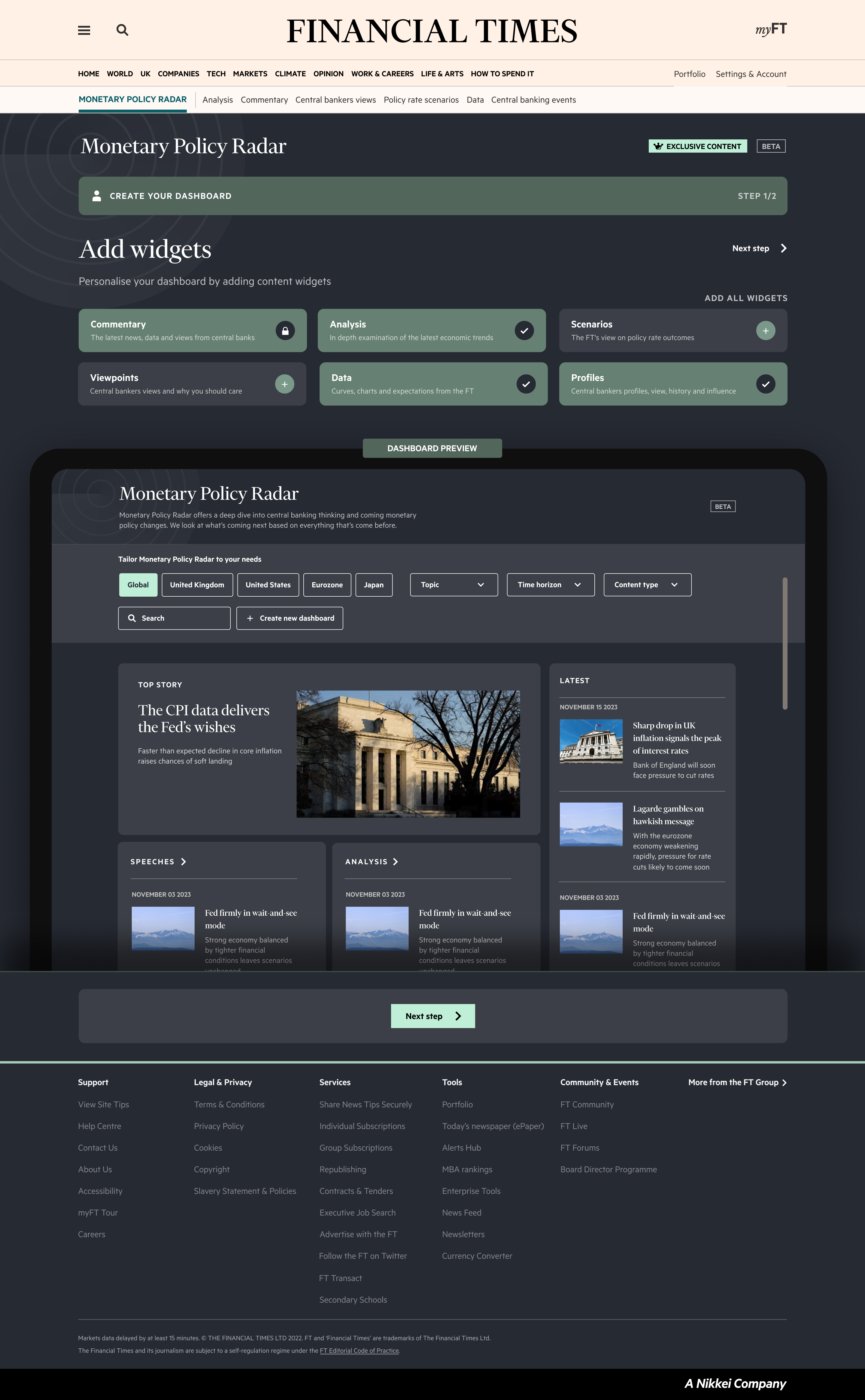
Added user delight and contextual iconography
To take the strain away from data entry, I built and utilised animated illustrations across the UX to add delight. Icons were also used to highlight premium features.
Differentiating the user experience
Applied a new FT Professional visual identity — using a refined colour palette, the new slate background, updated typography, and a clean illustration style. This differentiated visually from the standard FT / B2C experience.
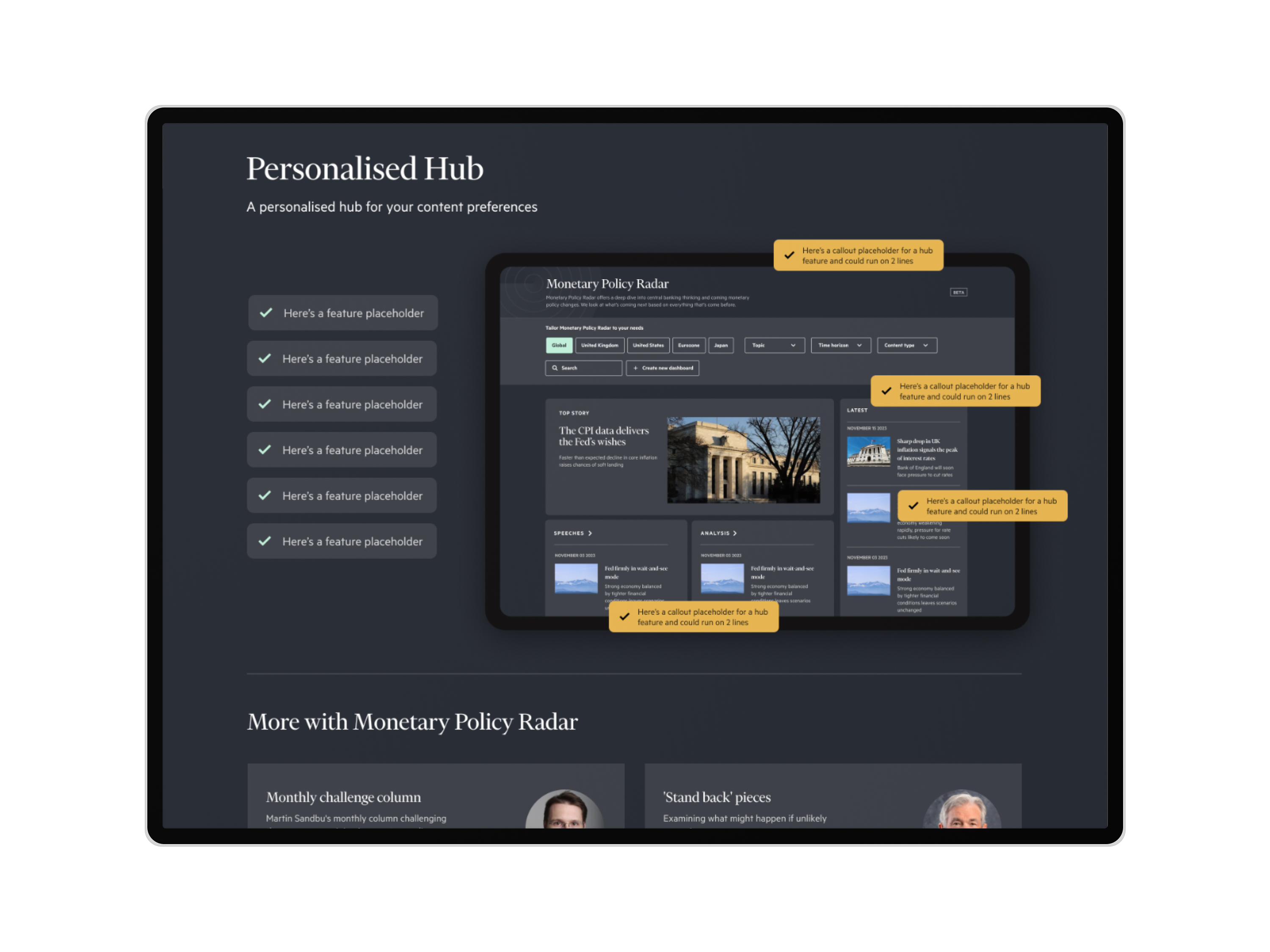
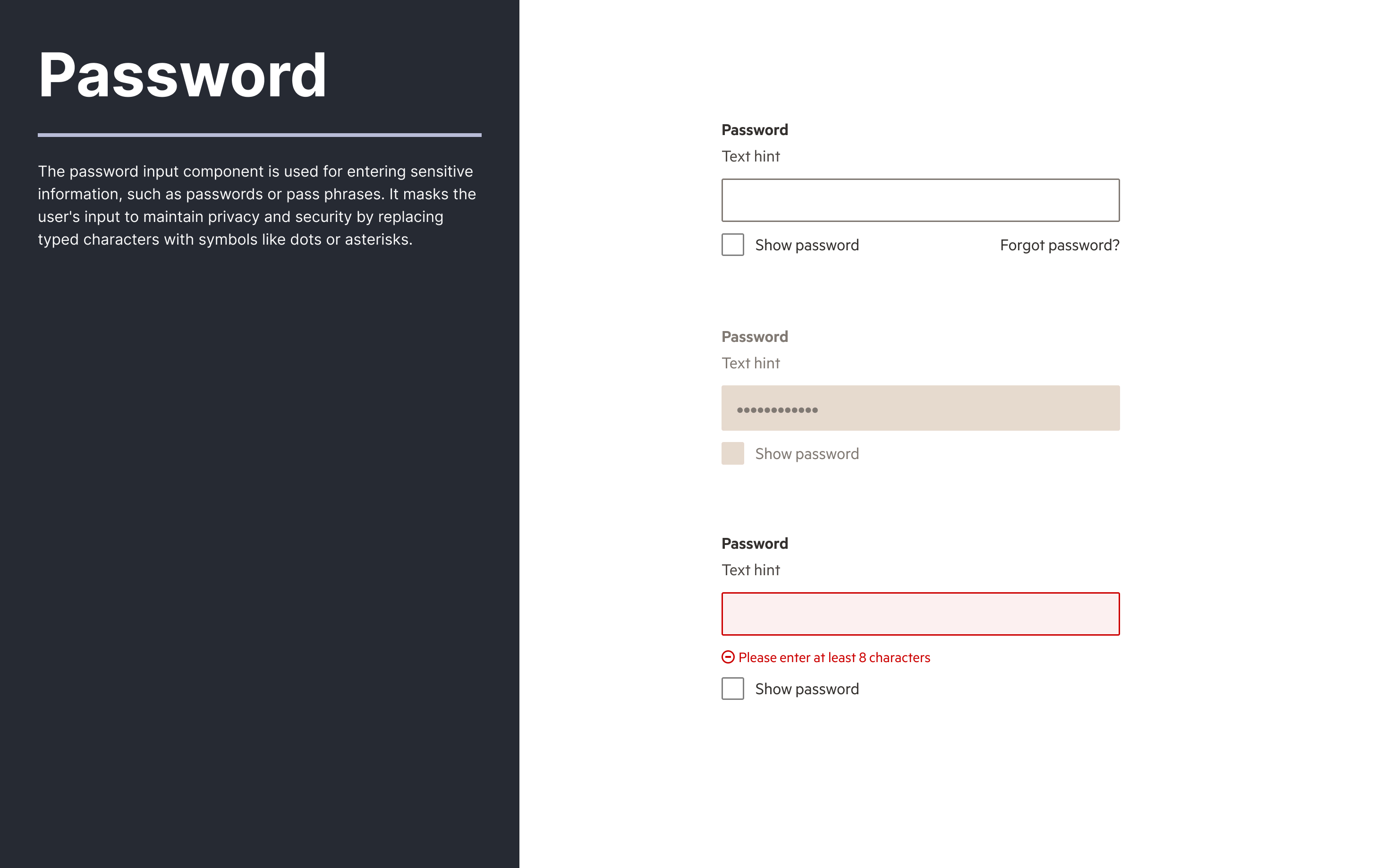
Established a premium UI kit
I created a new aligned with the FT brand, but introduced refinements — a simplified layout, slate-toned color palette, migration of new Origami editorial serif headings, and a considered and functional design system.
IMPACT
Post-launch testing and surveys with new and existing FT Professional users showed strong results:
- Brand awareness rose to 88% (from 23%) in follow-up perception testing.
- 4 out of 5 new users said onboarding clearly explained the value of their subscription.
- Internal stakeholder confidence improved, with commercial teams reporting easier product conversations with clients.


KEY LEARNINGS
While the launch was successful, it was important to reflect on what could be improved for future projects of this scale.
What went well:
Prioritising research and using it as a foundation for decision-making
The dual-track approach of qualitative and quantitative research gave us a firm understanding of the perception gap. By validating our hypotheses early and often, we ensured the design direction was solving real problems, not just aesthetic ones.
Taking a lean and iterative approach to onboarding design
By focusing on onboarding first — a high-impact, high-friction moment — we delivered noticeable improvements quickly, whilst setting the groundwork for future enhancements to the entire Professional experience.
What didn’t go so well:
Greater experimentation with visual language
Some of our early explorations for the brand direction were ambitious and expressive, but we narrowed the scope early to meet deadlines. In hindsight, we could have tested some of those bolder directions with users — we may have uncovered even stronger visual differentiators.
Post-onboarding touchpoints still need optimising
While onboarding was transformed, we also needed to find opportunity to improve post-onboarding moments — such as the Workspace dashboard, feature discovery, upsell prompts, and long-term engagement nudges. These should be addressed in the next phase to reinforce the premium positioning throughout the lifecycle of a subscriber and their expectations.
NEXT PROJECT
Just Eat Takeaway
