
summary
The Just Eat Takeaway redesign was focused on creating a seamless, intuitive sign-up flow and an efficient hub experience for new and existing restaurant partners.
Our goal was to make it easier for restaurants to join the platform, manage their business, and take advantage of features like Promoted Placement. Through deep user research and an iterative design process, we delivered a frictionless onboarding experience and a powerful hub interface that improved partner satisfaction and platform engagement.
24%
increase of successful signups
32%
decrease of abandoned signups
55%
uplift of Promoted Placement activations
Vision
As Just Eat Takeaway expanded its marketplace, it became clear that many restaurant partners found the sign-up and business management experience outdated and unintuitive.
Our vision was to simplify onboarding while empowering partners to grow their business with features like Promoted Placement, helping them increase visibility and orders with minimal effort.
ROLE & RESPONSIBILITIES
As Lead Product Designer on the project, I worked closely with Product, Research, and Engineering to bring the Partner Hub vision to life.
My responsibilities included:
- Leading design strategy and aligning with business goals
- Creating end-to-end flows for the sign-up journey
- Designing the Partner Hub dashboard interface
- Running workshops and usability testing sessions
- Collaborating with content designers on UX copy
- Ensuring accessibility standards across the experience
GOAL Metrics
Goal metrics were created to help us track our impact and to help steer the initiative. We aimed to:
- Increase the number of successful partner sign-ups
- Reduce the drop-off rate during onboarding
- Improve partner satisfaction with the management hub
- Boost the adoption, usage and engagement of Promoted Placement

RESEARCH
We conducted various research methods to gather insight into—interviewing restaurant partners in focus groups, analysing current usage through data, and generating surveys to gather qualitative understanding.
- Focus groups with restaurant owners and managers to understand pain points
- Generative research sessions to explore needs and motivations
- Surveys to validate insights and gather quantitative data
RESEARCH INSIGHTS
Some key insights emerged from these sessions which helped us to understand on a deeper level, the needs, expectations, pain points and issues.
Many users found the original sign-up flow confusing and repetitive
Users were often overwhelmed by the number of steps, encountered repeated questions, and struggled with unclear form instructions. This led to frustration, higher drop-off rates, and frequent calls to support.
Partners struggled to understand how to make the most of Just Eat tools
There was low awareness of the tools available in the Partner Hub. Partners felt they were left to figure things out on their own, and often didn’t realise they could access performance data, promotions, and marketing features.
Promoted Placement was underutilised due to unclear messaging and setup friction
Restaurant partners misunderstood what Promoted Placement offered and how it worked. The setup process lacked guidance and transparency, especially around budgeting and postcode targeting, leading many to abandon the feature altogether.
DESIGN PROCESS
Our goal was to create an intuitive, simplified and efficient onboarding and partner hub that restaurant partners could use easily and effectively. We followed a double-diamond approach for our design process to stay rooted in user insight, whilst aligning tightly with business goals across every stage.
Discover
We kicked off with a deep dive into qualitative and quantitative data from existing partners. This included reviewing call center logs, support tickets, and funnel analytics, which painted a clear picture of friction points in the onboarding flow and low engagement within the Partner Hub. Cross-functional workshops helped align stakeholders on the most pressing problems to solve.
Define
We translated insights into design principles such as ‘clarity over complexity’ and ‘guide, don’t overwhelm.’ Journey mapping exercises revealed duplication in the sign-up flow, while co-creation sessions with restaurant partners highlighted key areas where self-service tools lacked discoverability or felt too technical.
Develop
We rapidly prototyped the new sign-up journey using Figma, moving from wireframes to polished UI in close collaboration with engineering. We tested early flows with restaurant owners in moderated sessions, iterating on areas such as postcode entry and document upload. Special attention was paid to the Promoted Placement experience—introducing tooltips, progress indicators, and clearer budget guidance to demystify the setup process.
Deliver
Partnering with developers, we ensured a smooth handoff through detailed component specs, accessibility annotations, and responsive behavior guidelines. We QA’d across mobile and desktop to ensure parity and collaborated closely during implementation sprints to fix bugs and polish the interface before launch.


DESIGN DELIVERY
We created:
A clean, step-by-step sign-up flow with contextual help
We broke down the onboarding process into manageable, bite-sized steps to reduce cognitive load and maintain momentum. Each step was clearly labeled and accompanied by microcopy that explained what was needed and why. Where appropriate, we added visual cues and inline validations to guide users through without frustration. We also introduced a dynamic progress indicator so users knew how far they were and what was coming next.
A simplified Partner Hub dashboard with real-time insights
The new dashboard was designed to surface key information at a glance — including live order stats, customer reviews, and performance trends. Instead of burying tools in submenus, we grouped features around core partner goals: “Get More Orders,” “Improve Your Menu,” and “Promote Your Brand.” This goal-based navigation helped orient new users and provided a clear path to action.
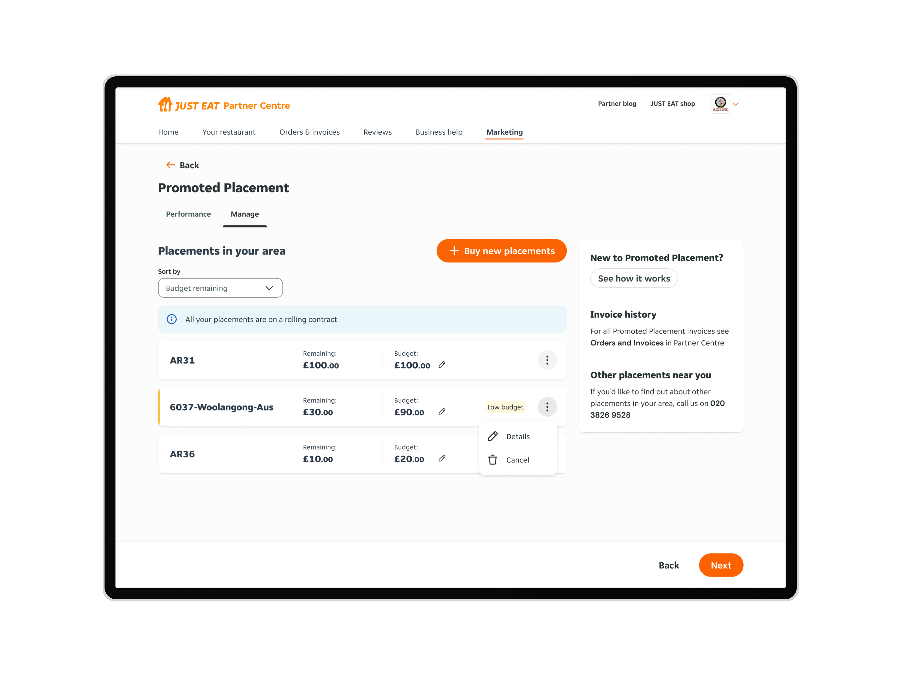
An improved Promoted Placement setup with postcode targeting and spend controls
To demystify Promoted Placement, we redesigned the setup journey from the ground up. We added postcode suggestions based on delivery zones, made the budget slider more responsive, and introduced real-time previews showing where and how the restaurant would appear in search results. Contextual explanations and cost-per-click logic were woven into the UI to help partners feel confident and in control of their ad spend.


IMPACT
The new Partner Hub and sign-up experience led to:
- Smoother onboarding with fewer partner support tickets
- Increased visibility and uptake of Promoted Placement features
- Better engagement from restaurant partners using the hub to grow their presence
Success Metrics
- 24% increase in successful sign-ups
- 32% reduction in onboarding drop-off rate
- 55% increase in Promoted Placement activations
KEY LEARNINGS
While the launch was successful and the process was robust, it was important to reflect on what could be improved for future projects of this scale.
Collaborative working across squads
This led to better feature cohesion and helped avoid duplicated efforts. Designers, developers, and PMs were aligned around shared goals, which streamlined decision-making.
Thorough research using generative methods
Conducting deep research with restaurant partners helped us to understand pain points and expectations early. Early prototyping meant we could also validate assumptions before committing to high-fidelity work. Testing rough concepts gave us fast, low-risk feedback that we could iterate on quickly.
Never underestimate the power of clear microcopy
Improving terminology, messaging, button labels, helper text, and form instructions significantly reduced user errors and confusion.
Partners want more guidance than we think
We assumed a level of digital savviness that didn’t reflect the diversity of business owners on the platform. For future optimisation of the platform, we could build with more support channels by default.

NEXT PROJECT
BBC Story of Life
