
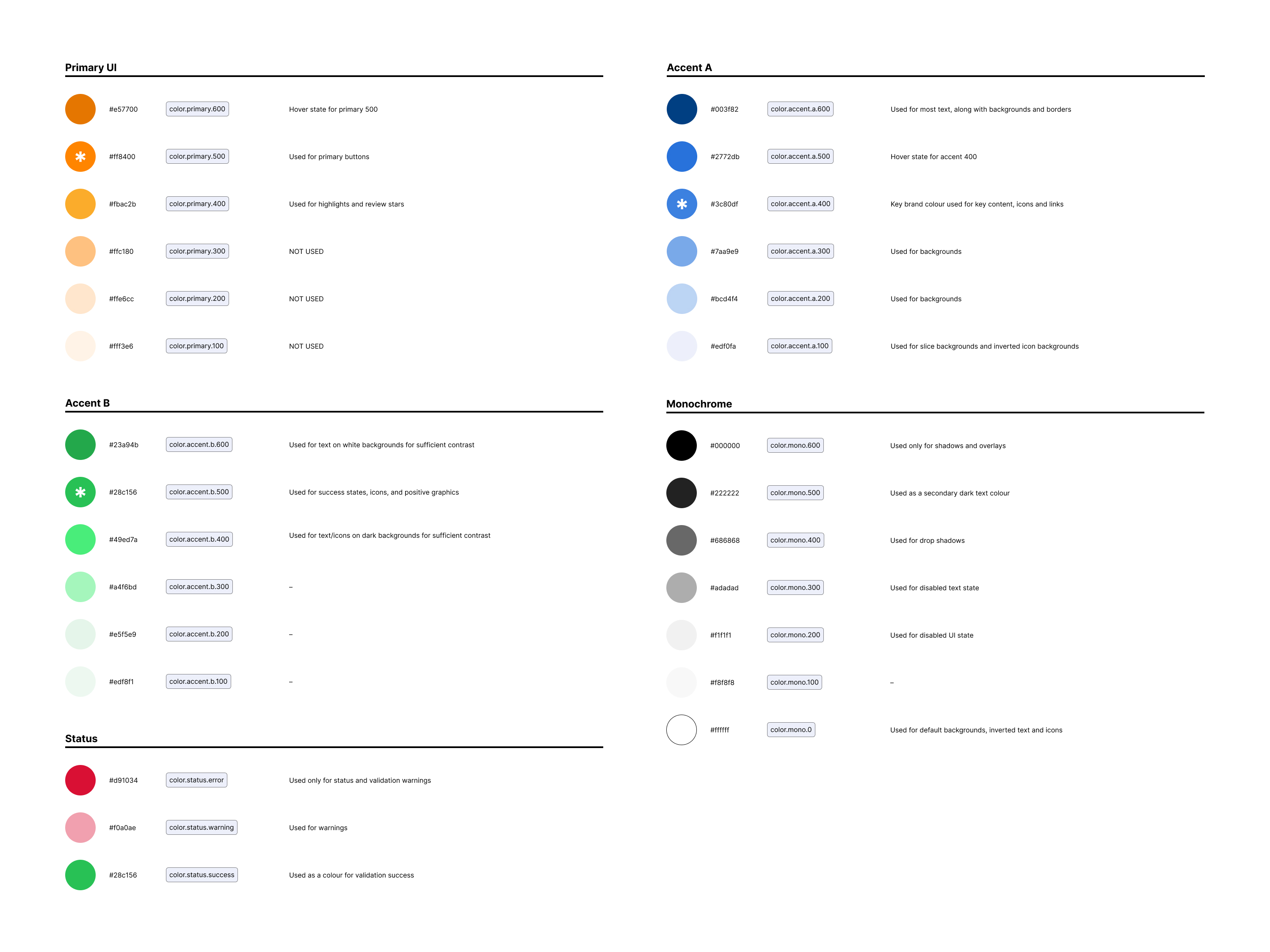
summary
The ZipHealth audio visual consultation journey was designed to create a seamless, intuitive, and compliant experience for customers in the US seeking prescription treatment and medication online.
I led the end-to-end product design and creative direction, delivering a clean, responsive UI that guides users smoothly through connecting with a clinician.
The work included a full rebrand initiative, incorporating ZipHealth’s new identity to reinforce credibility, trust, and modern healthcare convenience. Our design significantly reduced drop-offs, improved clinical approval rates, and increased user satisfaction.
Vision
The core vision was to reinvent the consultation experience for telehealth — turning what is often a clunky or impersonal process into one that is transparent, reassuring, and frictionless.
For ZipHealth’s customer base, quick access to clinicians and confidence in prescription outcomes was essential. Our goal was to design a digital experience that delivered on trust, speed, and simplicity, while also remaining medically compliant.
ROLE & RESPONSIBILITIES
As the sole designer and creative director on the project, I was responsible for:
- Leading the visual rebrand of ZipHealth’s interface
- Designing the entire consultation journey across mobile and web
- Creating wireframes, high-fidelity prototypes, and UI components
- Running and facilitating a two-week design sprint with stakeholders
- Conducting user interviews with customers and clinicians
- Collaborating with engineering, product, and legal teams to ensure feasibility and compliance
GOAL Metrics
We were aiming for:
- Reducing drop-offs during consultation journeys
- Increase completion rates of clinician video consultations
- Improve prescription approval rates
- Boost patient satisfaction and confidence
- Modernise and differentiate the ZipHealth brand
RESEARCH
We conducted user research interviews with both clinicians and patients to map out pain points and expectations. A focused 2-week sprint allowed us to:
- Journey map existing and ideal states
- Identify areas of friction, confusion, or expectation
- Validate assumptions and test early ideas

RESEARCH INSIGHTS
Through interviews, journey mapping, and usability testing, we uncovered the following core insights that shaped the experience:
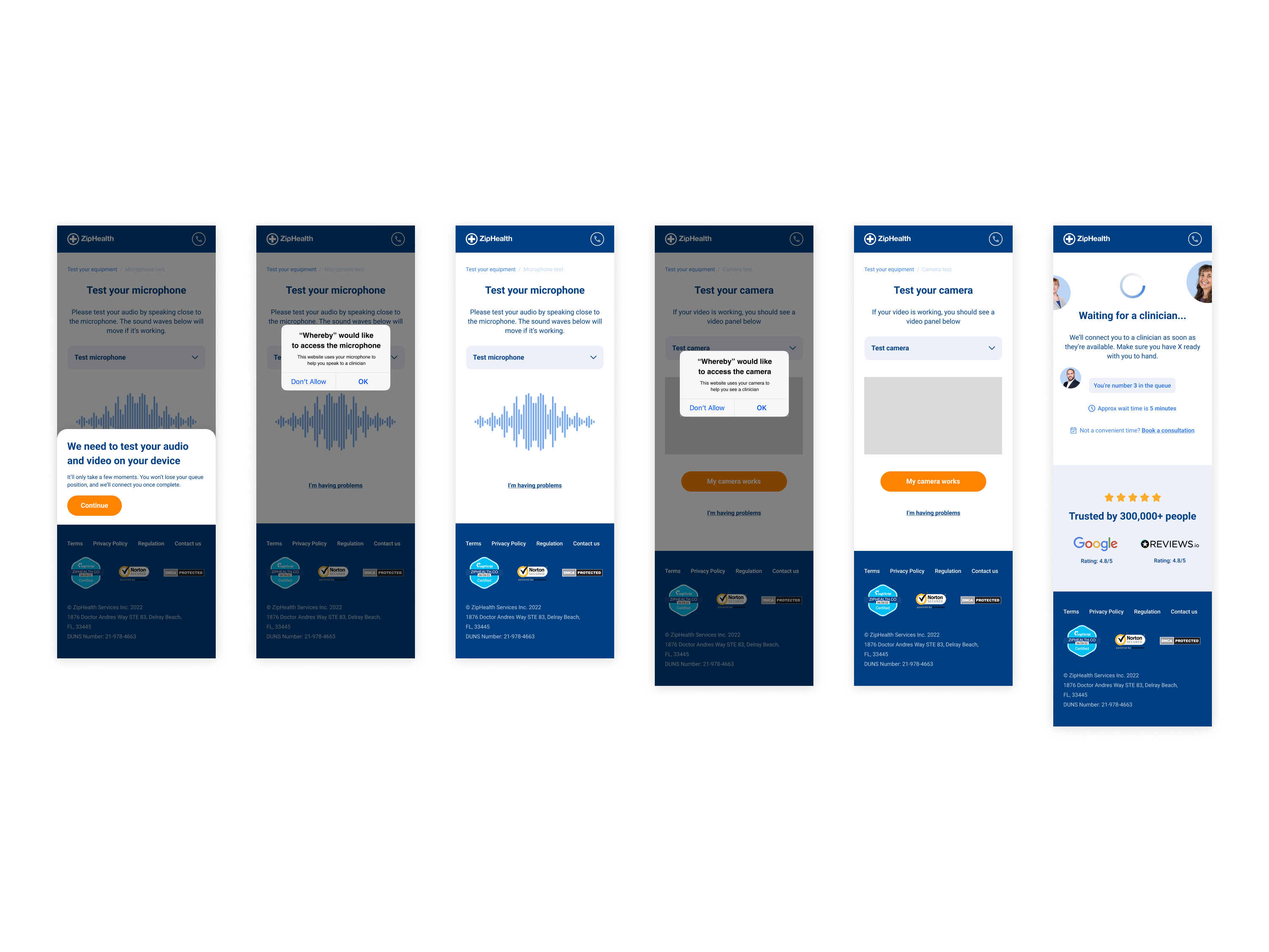
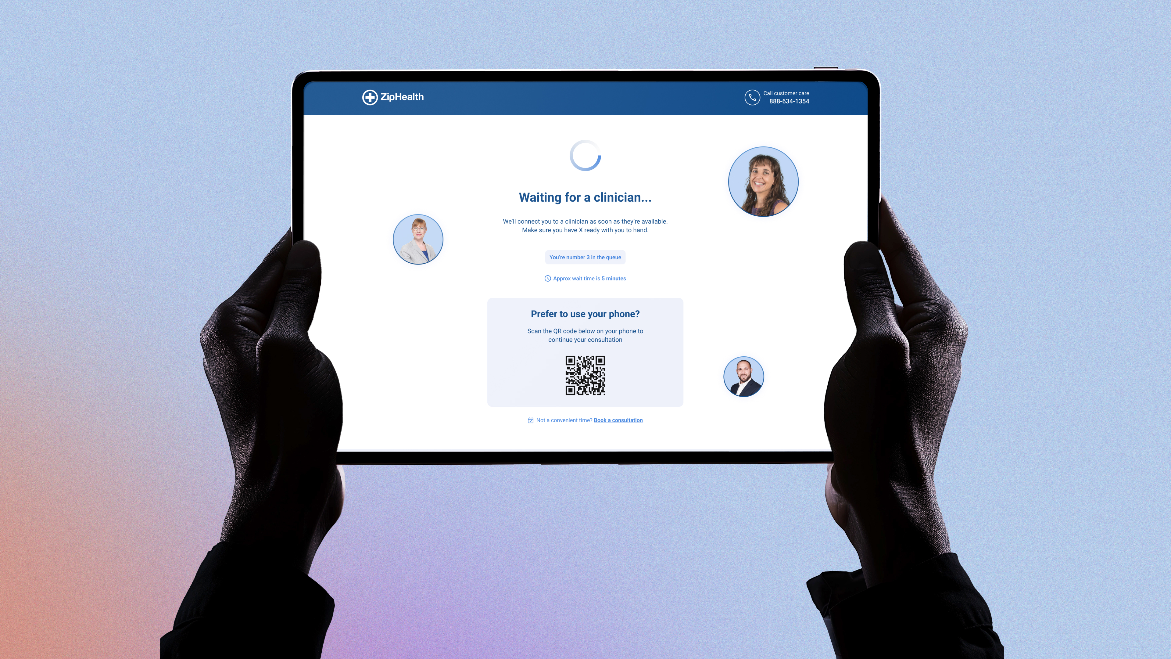
Users were often unsure how long they’d be waiting for a consultation, which caused drop-offs
Many users abandoned the process when they didn’t know how long they would wait for a consultation. Even a few minutes of ambiguity created doubt about whether the session was progressing. Users needed a clear sense of what to expect and when, especially during the virtual waiting stage.
Patients wanted reassurance about legitimacy and privacy
Patients expressed concerns about whether ZipHealth was a legitimate medical provider — especially in the early stages of their consultation journey. Elements like clinician credentials, privacy reassurance, and clear branding all contributed to building trust.
Clinicians needed a better view into patient context pre-call
Doctors often began video calls with little or no context about the patient’s condition or form submission. They wanted a pre-consultation snapshot or summary that would help them start the call more efficiently and empathetically.
Both groups desired a simpler, more intuitive experience with minimal distractions
Both patients and clinicians found the previous experience overly complicated. Patients wanted step-by-step clarity and gentle guidance, while clinicians preferred low-friction access to tools and patient data. A minimal, mobile-first design significantly improved usability for both groups.

DESIGN PROCESS
Our goal was to create an intuitive, simplified and efficient waiting room experience for both clinicians and patients.
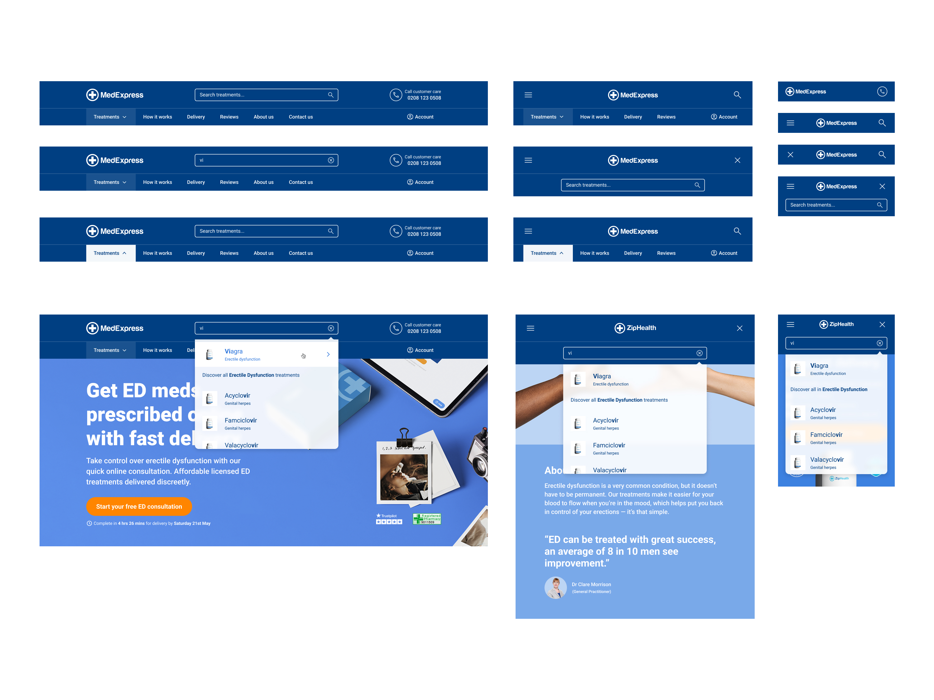
Rebranding the foundation
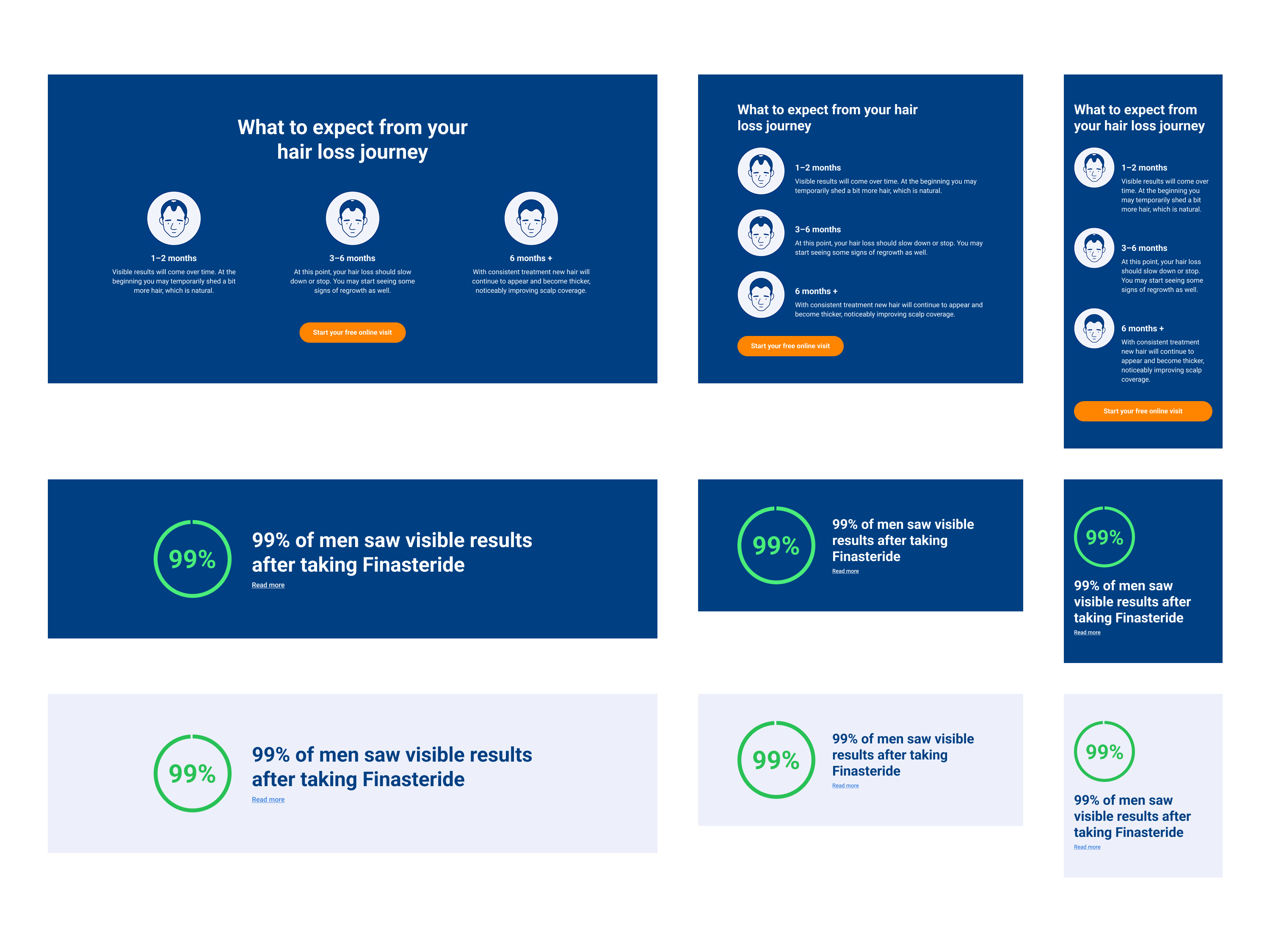
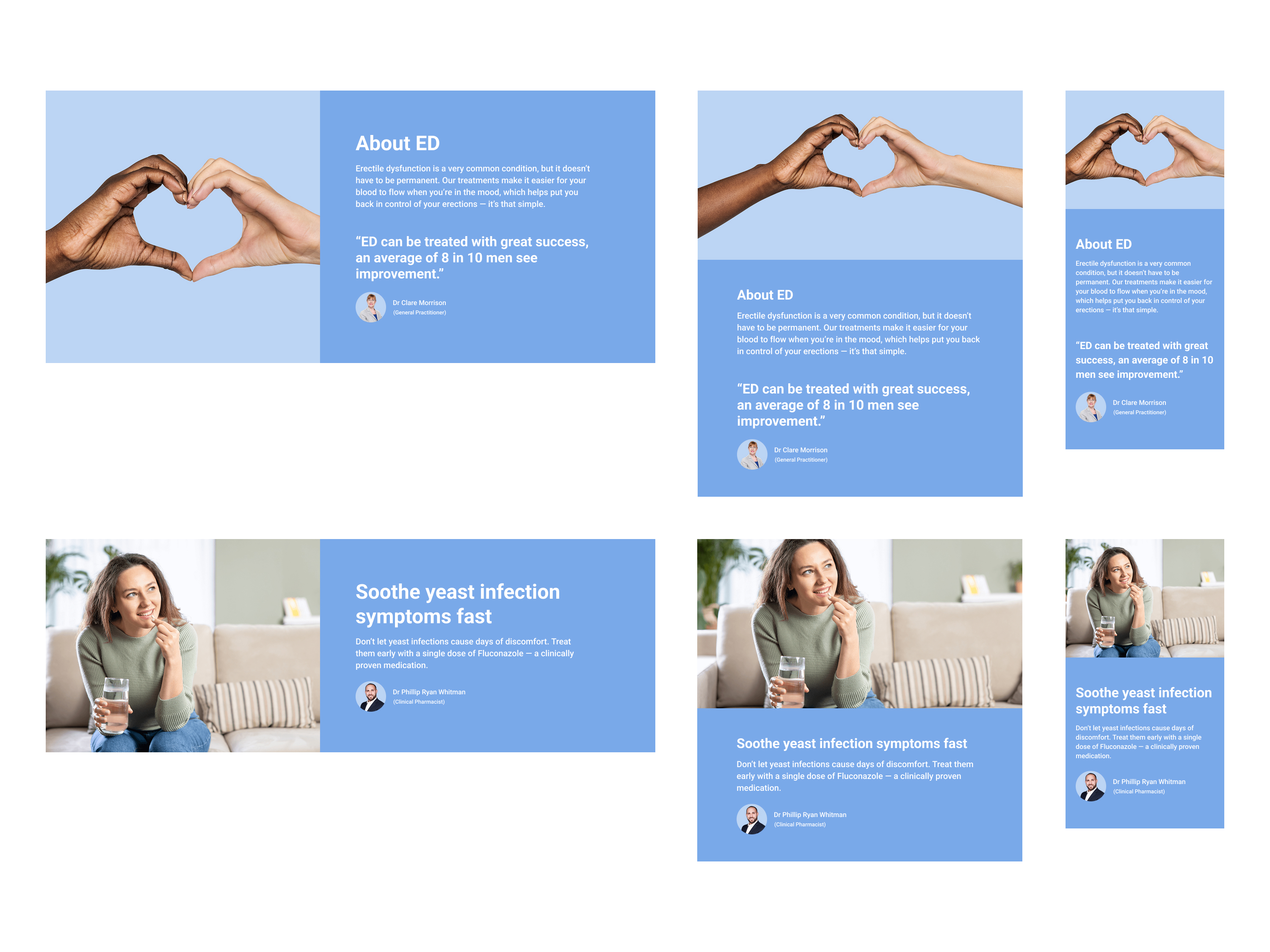
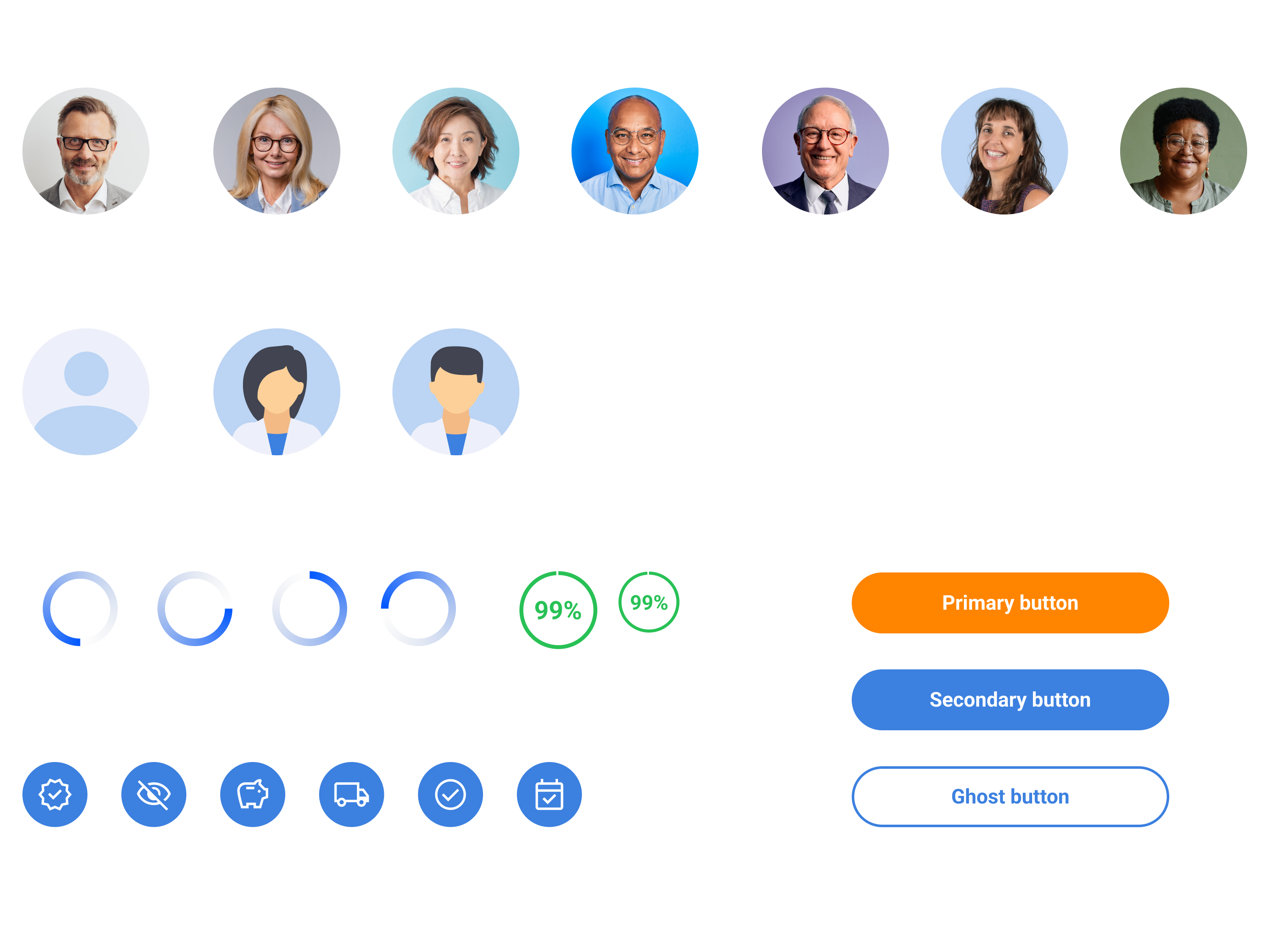
We kicked off with a visual rebrand to establish ZipHealth as a modern, trustworthy healthcare brand. This included a clean, calming palette, spacious layout, and a sans-serif typeface to convey clarity and ease.
Journey mapping and experience design
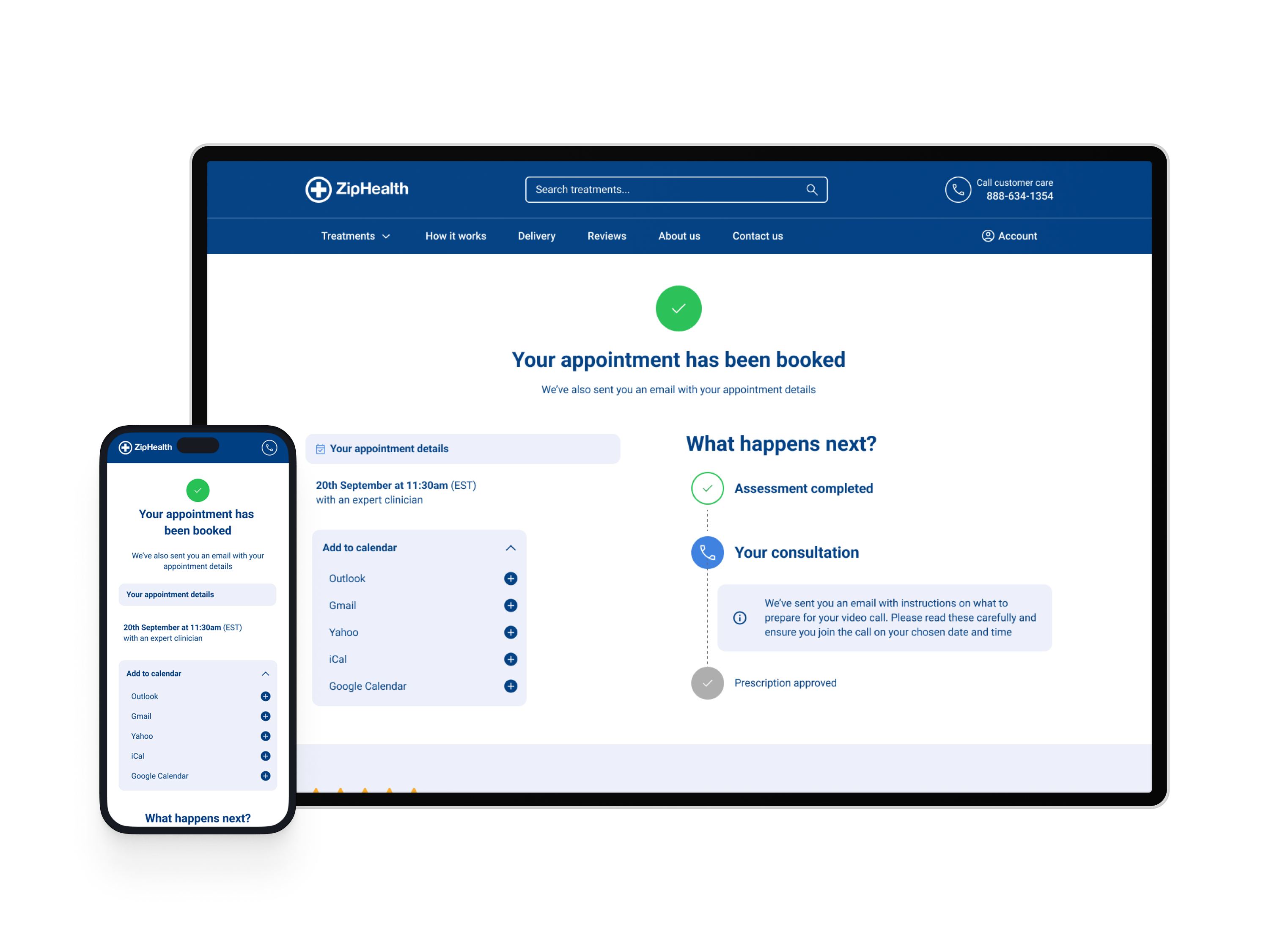
We mapped the end-to-end user flow: from starting a consultation, to waiting for the clinician, to post-visit actions. Emphasis was placed on reducing ambiguity and adding subtle reassurance at every step.
UI & interaction patterns
We built a minimal, mobile-first interface with clear status updates, a live progress indicator in the virtual waiting room, human-centric microcopy to reduce anxiety and responsive layouts to support any device. We also adding the ability to scan a QR code on desktop to continue their consultation. Adding a ‘book your consultation’ call to action as a fallback ensured patients could book if waiting times were excessive.
Prototyping and testing
We tested interactive prototypes with both patient and clinician participants. Iterations were based on clarifying next steps at each stage, shortening the onboarding experience and reducing jargon and focusing on user outcomes.


IMPACT
The new Audio Visual Consultation experience saw a marked improvement in user flow and brand trust. Feedback from patients highlighted the intuitive UI, realistic wait expectations, and minimal stress when connecting with clinicians. Clinicians reported better prep due to structured context pre-call.
Success Metrics
- 22% increase in consultation completion rate
- 17% decrease in user drop-off during the waiting stage
- 30% improvement in patient satisfaction (based on post-consultation survey)
- Improved NPS and trust ratings for the ZipHealth brand
KEY LEARNINGS
While the launch was successful and the process was robust, it was important to reflect on what could be improved for future projects of this scale.
Design sprints can be effective, but exhausting
A focused 2-week sprint with cross-functional involvement allowed us to quickly explore, build, and test ideas — driving faster decision-making and reducing long feedback loops. However, if not managed correctly they can be tiring, especially when having to align to various time zones.
Multiple user types requires balanced empathy
Designing for both clinicians and patients meant balancing needs. Patients wanted simplicity and comfort, clinicians needed efficiency and clarity. Getting this balance right was key to success.
User testing equals better outcomes
Running many rounds of unmoderated and interview-style testing revealed key drop-off points early — like the ambiguity in wait time — which we could quickly resolve.
Future considerations and iterations to optimise
- Add estimated wait times based on real clinician availability
- Personalise the post-consultation experience with recommendations
- Expand the design system to additional treatment flows
NEXT PROJECT
Financial Times
