
summary
For over six decades, Sir David Attenborough and the BBC have shaped our understanding of the natural world—pioneering storytelling that blends science, emotion, and awe.
With Story of Life, we set out to evolve that legacy for the digital age: designing a mobile experience that would inspire a new generation to explore nature on their own terms.
Vision
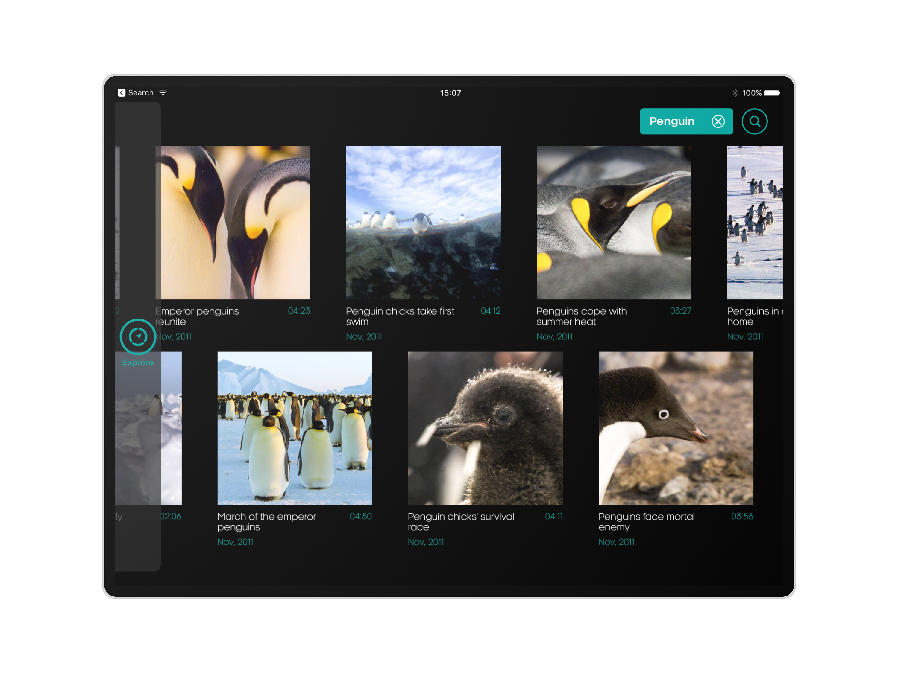
Our vision was to curate the largest-ever collection of Attenborough’s most iconic and breathtaking clips—spanning over 60 years of natural history broadcasting—and give users the power to explore and share their own journeys through the natural world and share them with others.
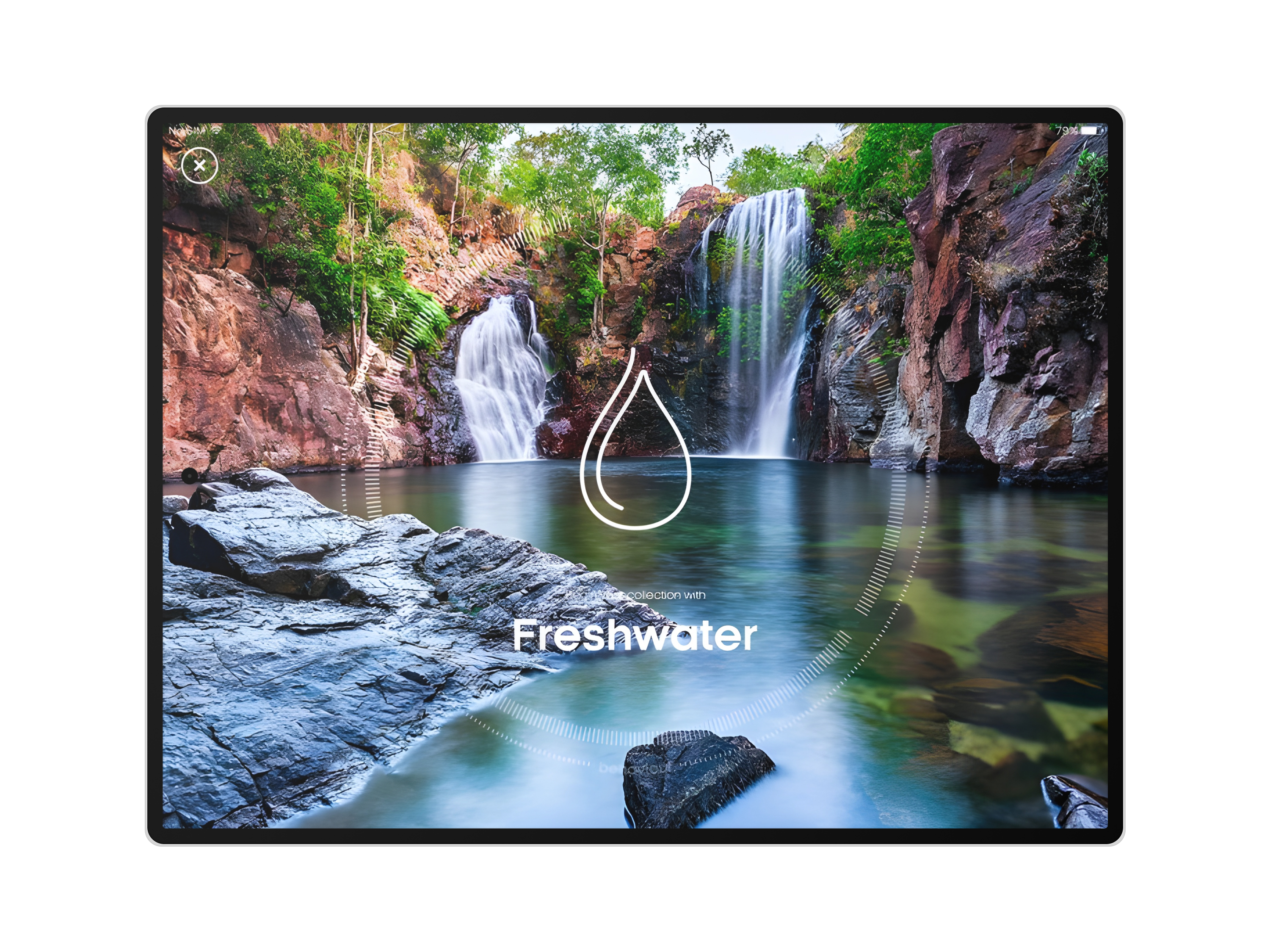
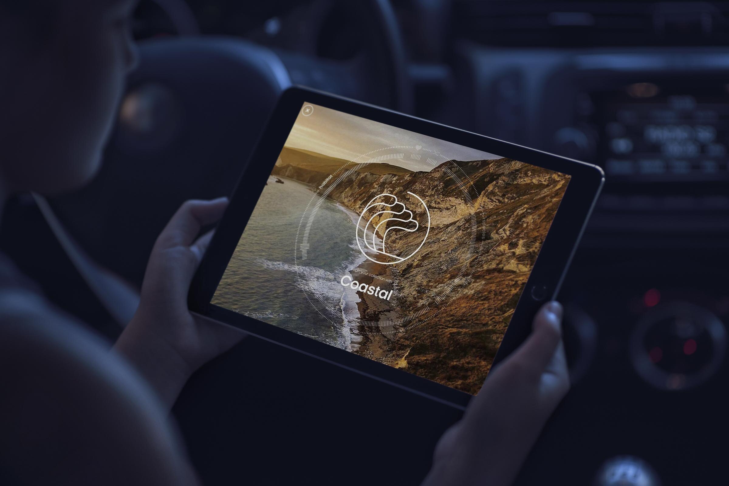
With over 1,000 landmark clips, users could build personal collections, discover thematic journeys, and interact with content in a way that felt personal, playful, and meaningful.
ROLE & RESPONSIBILITIES
As Creative Director aligned to the project, I led the design direction and conceptual development in close collaboration with AKQA and BBC teams.
I focused on:
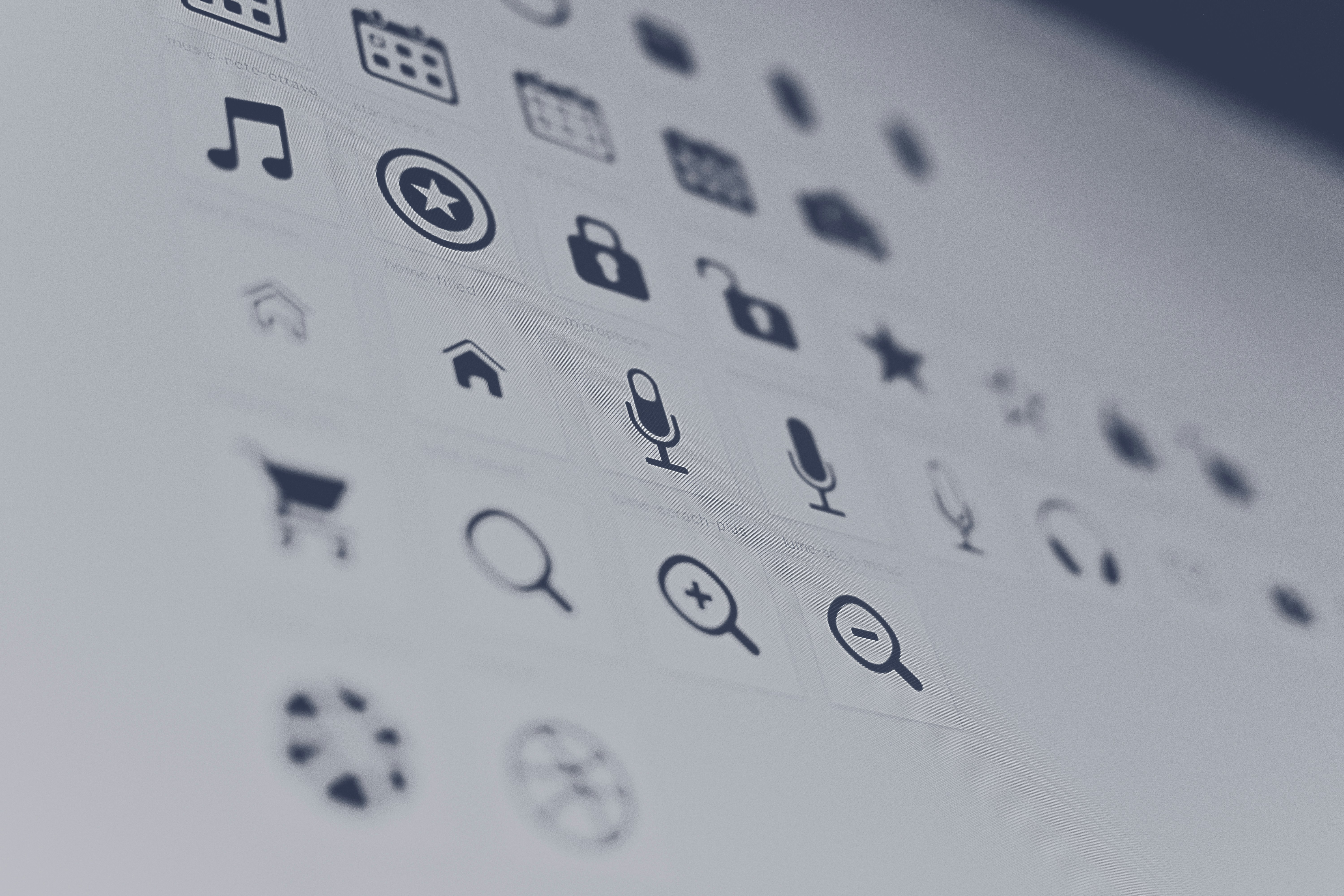
- Translating the BBC’s brand and accessibility guidelines (GEL) into a modern, intuitive UI
- Creating interaction concepts that felt natural and responsive on both iOS and Android
- Ensuring content was the hero—clear, immersive, and emotionally resonant
- Supporting development teams with a design system that scaled across platforms
GOAL Metrics
Business goal metrics were set at project initiation to help us track impact, learn from user behaviour and ensure the team are continuously improving the product experience.
- Increase dwell time and engagement on app-based video content as an engagement driver
- Increase visibility of natural history content and BBC Earth platform
- Improve user perception of BBC content quality, diversity and value
RESEARCH
We began with an immersive research phase—watching dozens of hours of content, reviewing audience insights, and aligning with the BBC’s educational mission.
Key priorities emerged:
- Content-first design that lets the clips shine
- Seamless cross-platform UX for both casual browsers and deep explorers
- Personalisation through collections, favourites, and dynamic content recommendations
- Accessibility compliance across all visual and interactive elements
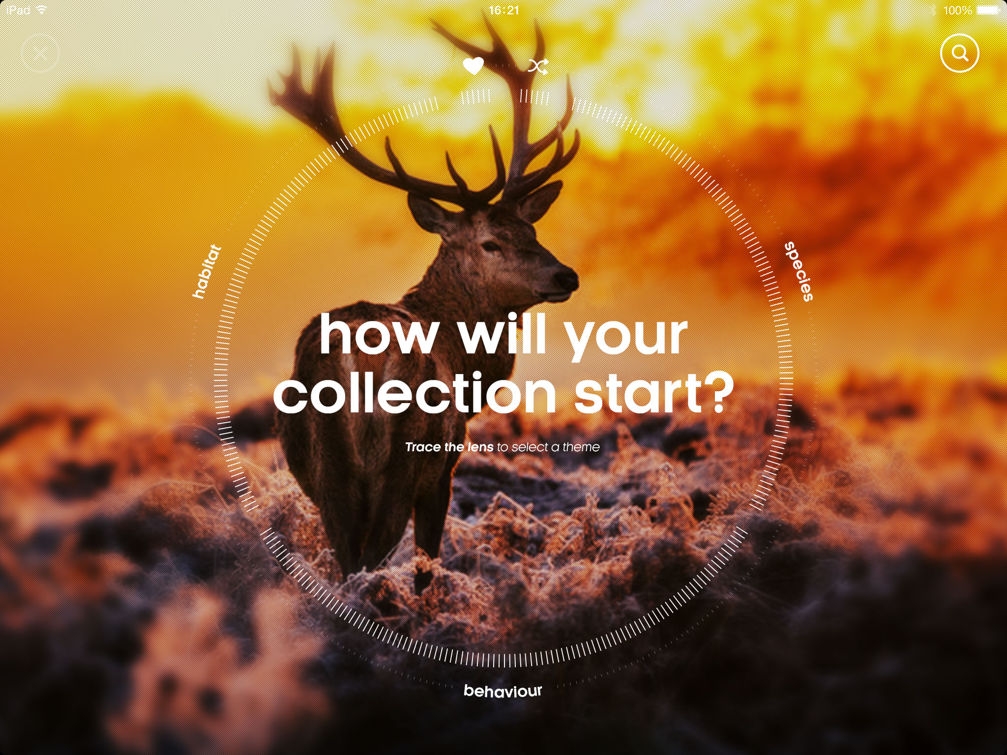
Prototyping and user testing guided iterations of the navigation, player interface, and content discovery model—ensuring users could intuitively find what moved them, and easily share it with others.

RESEARCH INSIGHTS
During generative research and usability testing, some common themes emerged:
Gesture-based controls felt inconsistent
We experimented with swipe gestures for browsing and saving clips, but they conflicted with platform-native behaviours—especially on Android. We reverted to clearer, more accessible UI patterns aligned with user expectations.
Overly complex clip navigation
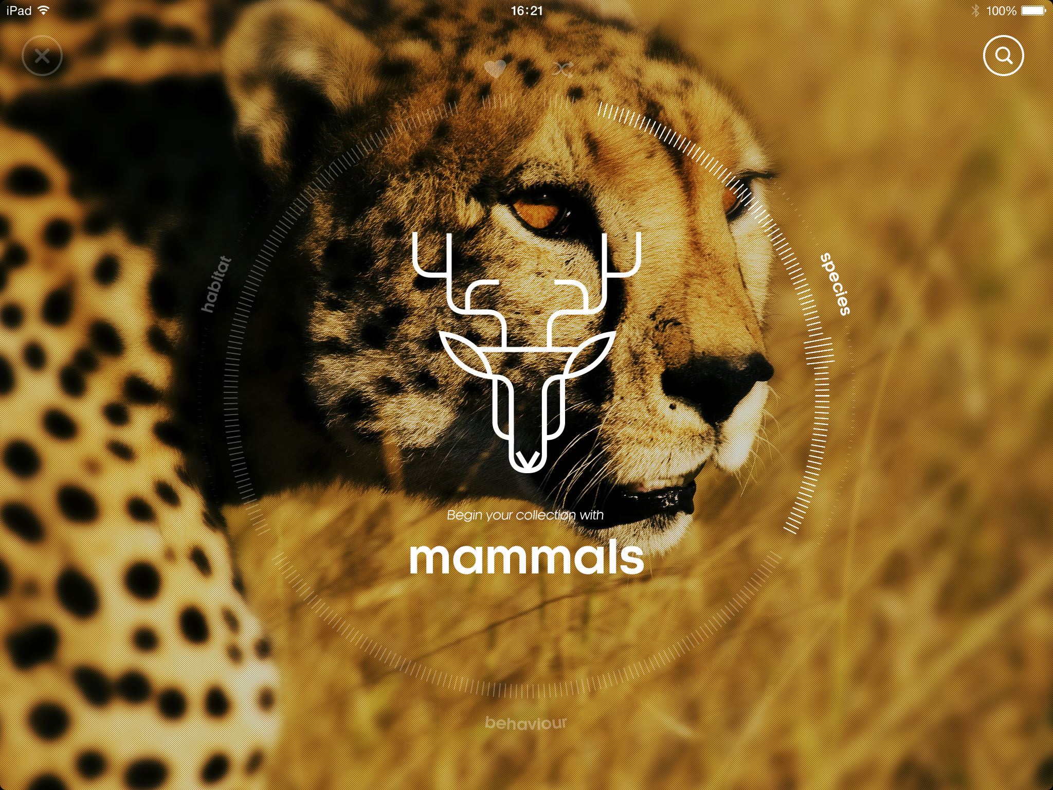
Our initial prototype featured a highly visual, timeline-based clip browser. While it looked impressive, users found it overwhelming and struggled to understand how to filter or explore specific topics. We pivoted to a simpler, category-based approach with smart search and curated journeys.
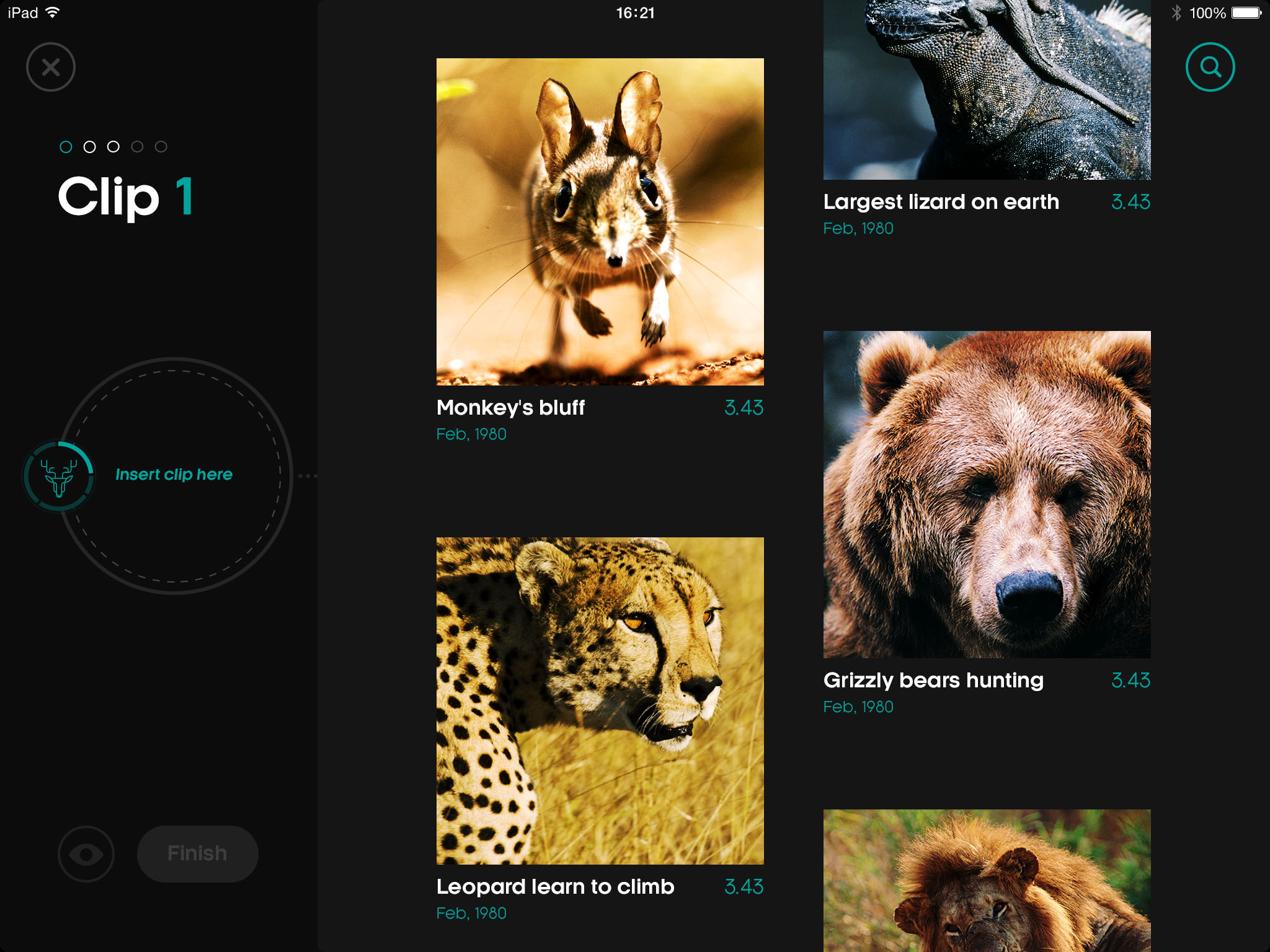
Personal collection creation felt unintuitive
Early versions of the “Create Your Own Collection” feature required too many steps and lacked visual feedback. Users didn’t understand if their selections were saved or how to share them. We refined this flow with inline animations and a persistent feedback layer to improve confidence and clarity.


DESIGN PROCESS
Our goal was to create a digital space that felt as thoughtful and awe-inspiring as the content itself—where design didn’t get in the way, but instead enhanced exploration and discovery.
Content-led and immersive
We designed with the principle that story comes first. Each clip needed room to breathe—full-bleed visuals, minimal UI chrome, and unobtrusive controls ensured the content remained the hero at every step.
Considered interactions
Inspired by the tone of Attenborough’s narration, the experience avoids unnecessary animation or visual noise. Instead, motion is used with purpose—to guide attention, smooth transitions, and reinforce hierarchy.
Modular, scalable layouts
With over 1,000 clips and an evolving archive, we built a modular design system to scale effortlessly. Components were built to adapt across viewports and platforms, maintaining consistency while respecting iOS and Android patterns.
Personal, yet universal
The interface invites curiosity, allowing users to curate their own journeys through nature. Light-touch personalisation—through collections, favourites, and suggested themes—balances individual agency with the integrity of the content.
Designed for everyone
We followed the BBC GEL accessibility standards throughout the design process. Every decision—from colour contrast and tap target sizing to alt text and focus states—was tested to ensure inclusivity across devices and audiences.


IMPACT & SUCCESS
Story of Life launched to widespread acclaim and helped bring the wonder of nature to new audiences in a format that felt modern, accessible, and beautifully crafted.
- Featured by both Apple and Google Play editorial teams
- Featured on multiple editorials, including The Guardian and Wired
- Averaged 5-star ratings across multiple platforms
- Surpassed 250,000+ downloads globally
- Nominated for a BAFTA and celebrated by leading design and nature communities alike
- +83% of users returned to the app within 30 days
- 7 minutes average session time on the app
- Qualitative feedback directly from users included “an immersive way to view natural history content” and that users “appreciated the ability to share cross platform to other users, so they could watch their own documentary.”
KEY LEARNINGS
While the launch was successful and the process was robust, it was important to reflect on what could be improved for future projects of this scale.
Navigating tight deadlines
Working within a compressed timeline required rapid ideation and decision-making, often balancing creativity with pragmatism. Prioritisation was essential—focusing on core features and ensuring polish where it mattered most.
Collaborating with multiple stakeholders
Balancing input from the BBC, AKQA, and platform teams meant constant alignment. Regular rituals, shared documentation, and visual prototypes helped manage expectations and keep momentum without losing clarity or vision.
Onboarding additional teams takes time
Bringing in other squads mid-project—particularly across development and QA—highlighted the importance of well-documented design systems and flexible tooling. Early alignment saves significant effort downstream.
Content as product
With 1,000+ iconic clips at the heart of the experience, respecting the emotional and educational value of the content was key. We learned how to let story drive interface, rather than forcing story into an interface.
Accessibility and platform nuances
Applying the BBC GEL accessibility standards across iOS and Android surfaced the subtle design tensions between brand, platform conventions, and user needs. Designing inclusively required deep attention to both interaction and visual detail.
NEXT PROJECT
Ask FT
 Ed Fairman